Android开发中的自定义控件
前言
大家可能会问 安卓的生态那么大 官方给出的可用控件那么多 我们为什么还要去学这个难又枯燥的自定义控件的知识呢,这对于安卓初级工程师或者初学者来说的确是不太要求掌握的。但你要是不想局限于小白,想成为更高级的安卓开发者,那么掌握自己造轮子的技术是非常有必要的,而且掌握了自定义控件,你可以随时应对以后产品经理的无理需求是不是?哈哈哈。
自定义控件的步骤
首先想要做一个控件是有一个完整的流程和套路的,下面我用一张流程图来展示。
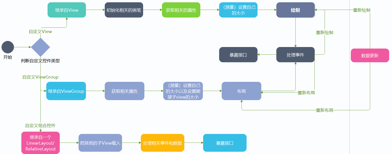
控件的类型
首先控件可以分为两大类,一种是View,一种就是ViewGroup。
View
那么什么是view呢?通俗点说就是一个孩子,它不能再容纳更多的控件了,它只是它自己,就比如说Button,TextView,这种就是View。
1
2
3
4
5
6
7
8
| <TextView
android:text="GE"
android:textSize="25sp"
android:textColor="@color/black"
android:layout_gravity="center"
android:layout_width="wrap_content"
android:layout_height="wrap_content">
</TextView>
|
ViewGround
ViewGround从字面翻译过来就是视图群,也就是说在这个控件里面它是父亲,它能容纳多个控件,比如我们的布局,LinearLayout等等。
1
2
3
4
5
6
7
8
9
10
11
12
13
14
15
16
17
18
19
20
21
22
23
24
25
26
27
28
29
30
31
32
33
34
35
36
37
| <LinearLayout
android:layout_width="wrap_content"
android:orientation="horizontal"
android:layout_height="wrap_content">
<TextView
android:layout_width="wrap_content"
android:text="18个关注"
android:layout_height="wrap_content">
</TextView>
<TextView
android:layout_width="35dp"
android:gravity="center"
android:text="|"
android:layout_height="wrap_content">
</TextView>
<TextView
android:layout_width="wrap_content"
android:text="12个粉丝"
android:layout_height="wrap_content">
</TextView>
<TextView
android:layout_width="35dp"
android:text="|"
android:gravity="center"
android:layout_height="wrap_content">
</TextView>
<TextView
android:layout_width="wrap_content"
android:text="LV10"
android:layout_height="wrap_content">
</TextView>
</LinearLayout>
|
由以上代码就可知,这一个LinerLayout作为ViewGround一共容纳了五个TextView控件。
看到这里相比大家对View和ViewGround有一个清晰的认知了吧。那么我们接着讲自定义控件。
控件的自定义属性与获取
做一个自定义控件最基本的就是要自定义控件的属性了。属性有包括颜色,控件高度,宽度,圆角等。
以下就是LinearLayout的属性。
1
2
3
4
5
6
7
8
| <LinearLayout
android:layout_width="wrap_content"
android:layout_height="wrap_content"
android:layout_alignParentBottom="true"
android:layout_centerHorizontal="true"
android:layout_marginBottom="41px"
android:orientation="horizontal">
</LinearLayout>
|
自定义属性的步骤
1.声明属性
首先找到项目文件中的values中的themes文件,控件的属性就可以在这里声明。如下:
1
2
3
4
5
6
7
8
9
10
11
12
13
14
15
16
17
18
19
20
21
22
23
24
25
26
27
28
29
30
31
32
33
34
35
36
37
38
39
40
| <resources xmlns:tools="http://schemas.android.com/tools">
<declare-styleable name="Flowlayout">
<attr name="maxLine" format="integer"/>
<attr name="itemHorizontalMargin" format="dimension"/>
<attr name="itemVerticalMargin" format="dimension"/>
<attr name="textMaxLength" format="integer"/>
<attr name="lines" format="integer"/>
<attr name="textColor" format="color"/>
<attr name="borderColor" format="color"/>
<attr name="borderRadio" format="dimension"/>
</declare-styleable>
<declare-styleable name="InputNumberView">
<attr name="max" format="integer"/>
<attr name="min" format="integer"/>
<attr name="defaultValue" format="integer"/>
<attr name="step" format="integer"/>
<attr name="binBackground" format="reference"/>
<attr name="disable" format="boolean"/>
</declare-styleable>
<declare-styleable name="SlideMenuView">
<attr name="function_t" format="enum">
<enum name="delete_t" value="0x30"/>
<enum name="read_t" value="0x50"/>
<enum name="top_t" value="0x03"/>
</attr>
</declare-styleable>
<declare-styleable name="WatchFace">
<attr name="secondColor" format="color"/>
<attr name="minColor" format="color"/>
<attr name="hourColor" format="color"/>
<attr name="degreeColor" format="color"/>
<attr name="scaleColor" format="color"/>
<attr name="FaceBackground" format="reference"/>
<attr name="scaleShow" format="boolean"/>
</declare-styleable>
</resources>
|
右上可知声明属性attr的语法都是先由 declare-styleable来包含。其中name即属性的名字,而后面的format则是该属性的类型。比如说我要定义一个颜色,就按照下面这样写:
1
| <attr name="degreeColor" format="color"/>
|
2.使用属性:
比如说我要使用WatchFaceView中定义的背景图片属性:
1
2
3
4
5
| <com.example.watchface.WatchFaceView
android:layout_width="312dp"
GE:FaceBackground="@mipmap/bg"
android:layout_height="306dp" >
</com.example.watchface.WatchFaceView>
|
3.添加命名空间:
添加这个的目的是为了方便获取到空间的属性。
1
| xmlns:GE="https://schemas.android.com/apk/res-auto"
|
4.获取属性值
在类中有固定的方法来方便我们获取自定义控件的属性值,下面以我做的SlideMenu这个自定义控件来举例。
首先在SlideMenu这个类中,我们需要重写四个方法:
1
2
3
4
5
6
7
8
9
10
11
12
13
14
15
16
17
18
19
| public SlideMenuView(Context context) {
this(context,null);
}
public SlideMenuView(Context context, AttributeSet attrs) {
this(context, attrs,0);
scroller=new Scroller(context);
}
public SlideMenuView(Context context, AttributeSet attrs, int defStyleAttr) {
super(context, attrs, defStyleAttr);
}
public SlideMenuView(Context context, AttributeSet attrs, int defStyleAttr, int defStyleRes) {
super(context, attrs, defStyleAttr, defStyleRes);
TypedArray a = context.obtainStyledAttributes(attrs, R.styleable.SlideMenuView);
function = a.getInt(R.styleable.SlideMenuView_function_t, 0x30);
a.recycle();
}
|
由以上代码可知,我们可以通过上下文context.obtainStyledAttributes();方法来获取到刚刚我们在资源文件中自定义的控件中的一个TypedArray实例,我们可以通过这个实例来获取到具体各个控件的属性值,比如说上面的function。
测量
测量在自定义控件中是非常重要的,需要大家去重点掌握。其中ViewGround有两种:一种是测量自己(设置自己的大小),一种是设置期望孩子的大小。而View则是测量自己的大小。
1.重写onMeasure方法
1
2
3
4
| @Override
protected void onMeasure(int widthMeasureSpec, int heightMeasureSpec) {
super.onMeasure(widthMeasureSpec, heightMeasureSpec);
}
|